Designing a Logo
Of course our dream goal is to develop a successful little swimwear and apparel/accessories brand that provides an essential creative and mental outlet and funds the fun we crave (beach volleyball, travel, dining out, etc.) Can’t hurt to dream right! :-) While this project is certainly providing the creative/mental outlets, in reality it is definitely cutting into our volleyball time!
One of the most consuming tasks so far has been the search for a logo. The most obvious symbol to connect with the name “Pepper” would be a chili pepper and although we love spice (literally and figuratively!) we are not feeling any culinary connections for this product. Our “Pepper” relates to the common volleyball warm up drill and although we are avid amateur players and beach volleyball enthusiasts, we are weary of potentially excluding people by using the word “beach volleyball” in our name or using the image of a volleyball in our logo/symbol. (If we get it right, you won’t need to be a beach volleyball player to appreciate this bikini!) Right away this rules out a lot. The other unfortunate thing we discovered is that the letter “P” is difficult to work with in a design. We also learned that two “p’s” with their backs together looks like a penis – again not a good fit!
![]()
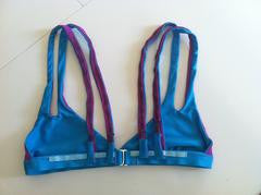
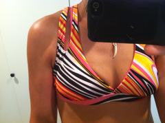
Here is a small sampling of the logo ideas we considered along the way.
In the process of exhausting our own ideas we figured out what we did and did not want and decided to post our project on DesignCrowd, a popular crowd sourcing marketplace for design projects. We received A LOT of designs but we only seriously considered one of them and it was ultimately rejected when a trusted opinion likened it to clip art! We then worked with a European designer who’s portfolio we liked but this didn’t produce a winner either.
| Finally a logo with potential! We purchased this from the designer with the intent to “re-purpose” it as our own. | The current Pepper Swimwear logo symbolizes a ball, earth, sun, peppercorn, etc. surrounded by flames. |
Finally, when we were at a point of near total frustration, Sibylle went to Europe and did some wine-infused brainstorming with her Austrian best friend and emailed back some of their ideas. One of them included a a logo they found online for a company called Fireball Investors. I really liked this concept as well and since Sibylle and I were having trouble finding a logo concept we could agree on I was eager to pursue it. I figured it was a long shot but I contacted the designer and offered to purchase the logo if it was not in use. He agreed (shocker!), and for a relatively reasonable amount of money.
Unfortunately though we were not going to be able to just slap our name on and run with it. A few designers and many, many designs later we arrived at the current working Pepper logo. It has the movement we were seeking with a contemporary vibe that feels relevant to beach volleyball and beyond without being overly athletic or sporty. Good thing we didn’t give in to design fatigue – we’re very excited about this final product!
– Bridget
Leave a comment
This site is protected by hCaptcha and the hCaptcha Privacy Policy and Terms of Service apply.